Redefining “Neutral” in 2014 Interior Design
Here at Eclipse Shutters, we know that after a long day at work, the first thing you want to do is kick back and relax. Everyone unwinds in their own personal way, but the color of your home’s walls can have a significant impact on how you get to this state of mind. This is no trade secret; many studies have been conducted on the psychological impact of the color spectrum. Bright, bold shades like yellow and green are motivating, uplifting and energizing, while more neutral earth tones are praised for their tranquility-inspiring powers.
A New Approach to Neutral
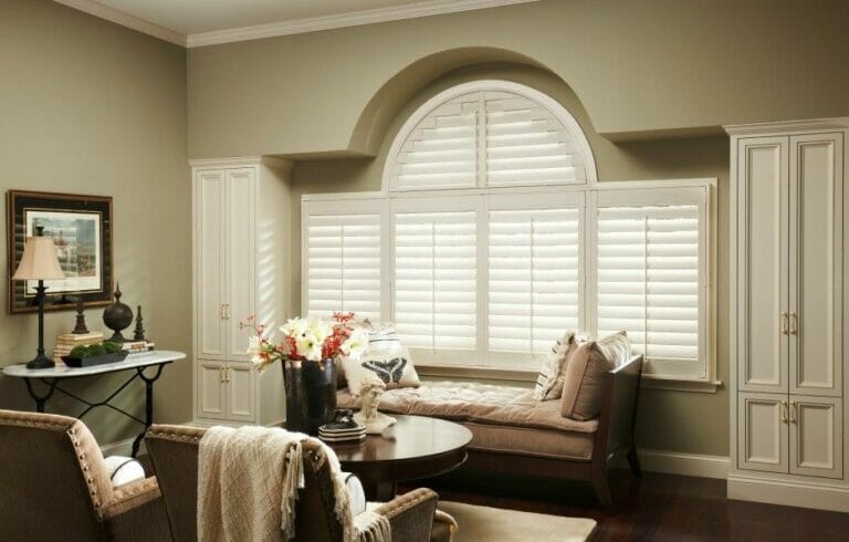
Armed with this knowledge and a desire to give their customers complete control over how to craft a unique living space, Benjamin Moore has recently launched a new neutral color palette for its 2014 paint inventory. These swatches illustrate an emerging trend, one that focuses more on the experience you get when you walk through the door. Your home is your sanctuary, and these neutral tones were created to make this part of your life stand out and be noticed in a subtle yet captivating manner. The shift away from bold and daring to beautifully humble is here. These colors instantly set the mood and complement existing room decor like our shutters and other window coverings. The neutral palette is organized into four broad color sections. The first is the “Greens and Earthy Neutrals,” and they range from the brightest Van Alen Green to the darker Sparrow. This color scheme is ideal for people wanting to craft a warm and inviting atmosphere. As such, they are recommended in rooms that are meant to be a source of comfort rather than stimulation (e.g. bedrooms, restrooms). The “Plums and Lavender” section is comprised of five tones (Lavender Mist, Super Nova, Nightingale, Black Satin and Iced Mauve). Formal living spaces and master bedrooms are where these colors shine. Purple is a naturally feminine tone and is a great way to add a touch of flair to a much-needed space. Black Satin is the darkest shade on the new neutral palette (some may consider it outside the spectrum) and should be placed in larger rooms when the goal is to direct attention or to form a dramatic focal point. The “Blue Family” is light, cool and airy, but also features some darker colors as well (Van Deusen, Flint and Normandy). The last group is the “Pinks and Neutrals,” which includes Light Peach and Coral Essence. Every shade in Benjamin Moore’s 2014 collection is intended to mesh well with home furnishings. Neutrals go perfect with artwork, pottery, textiles, carpet and especially your interior shutters from Eclipse Shutters.